
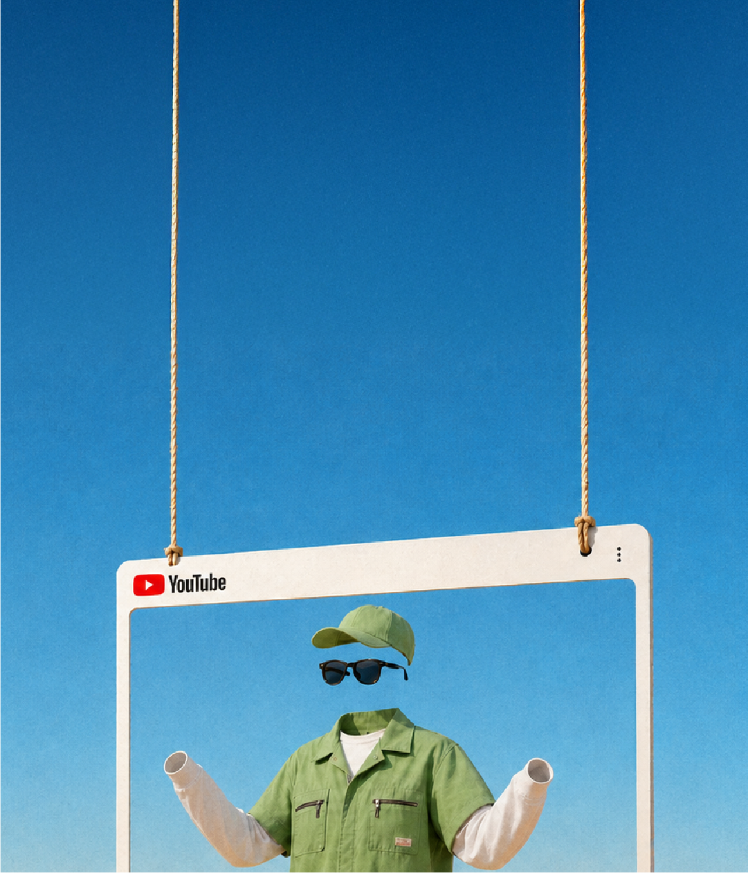

YouTube Thumbnail Mistakes Creators Keep Making

by ByThen Editorial
August 3, 2026
"Don't judge a book by its cover" is advice people never actually follow. The fact is our brain won't let us. Princeton researchers found it takes just 100 milliseconds, a tenth of a second, to form a judgment about a face: trustworthy, likeable, worth your time. More viewing time barely changed the verdict.
So on YouTube, the thumbnail isn't a preview of the decision. It is the decision. It loads before the title registers and before a single second plays. A viewer has already judged your video before they know what it's about. That means a great video with a weak thumbnail is a great video nobody opens.
Most YouTube thumbnail design tips tell you what to put in the frame. This is about what quietly costs you the click, and how to fix it. You'll see YouTube thumbnail examples of each mistake, split into two parts: the ones almost every creator makes, and the ones that trip up faceless creators specifically.
Mistakes Almost Every Creator Makes
These show up across niches, subscriber counts, and content types. Fix these first.
1. Cramming too much into one frame
The rule: A strong thumbnail shows one clear idea.
The mistake: Stuffing a face, a logo, three lines of text, an arrow, and a background scene into a space the size of a postage stamp. Every element competes, so none of them win.
The fix: Pick one focal point and build around it. One subject, one short message, one clear emotion. If you can't explain the thumbnail in a single breath, it's doing too much.
2. Writing a sentence instead of a hook
The rule: Limit thumbnail text to three to five words in a large, bold font.
The mistake: Treating the thumbnail like a caption. Long phrases shrink the font, and small text disappears on a phone. The title already carries the full context. The thumbnail text should add tension, not repeat the title.
The fix: Cut to the sharpest three to five words. Add a stroke, shadow, or solid color block behind the text so it stays legible over any background. Think headline, not sentence.
3. Low contrast that melts into the feed
The rule: High contrast makes your subject and text pop.
The mistake: Muddy colors, a busy background, and text that blends into it. On a crowded feed your thumbnail sits next to a dozen others. Low contrast makes it invisible.
The fix: Separate your subject from the background with contrasting color and light. Data backs this up: one analysis found 89% of breakout videos used a face or high contrast. Bright against dark, warm against cool, sharp against soft. Contrast is what earns the glance.
4. A flat, neutral expression
The rule: Emotion drives clicks.
The mistake: A calm, neutral face, or a subject with no clear feeling at all. Neutral reads as forgettable. The brain that judges a face in 100 milliseconds is looking for a signal, and "nothing" is not a signal.
The fix: Show a real, readable emotion that matches the video. Surprise, tension, joy, curiosity. Studies found expressive faces can lift click-through rate by 20 to 30% over neutral ones. The face does not have to be yours, but the emotion has to be obvious.
5. Designing for a desktop you don't watch on
The rule: Most YouTube watch time happens on phones.
The mistake: Designing a thumbnail that looks great full-size on a monitor, then never checking it small. On mobile feeds YouTube may crop or zoom the frame, and tiny details vanish.
The fix: Design for the smallest screen first. Keep faces and key text away from the edges, since those get cropped. Then shrink your thumbnail to roughly 160 by 90 pixels and look at it. If it still reads at that size, it will read anywhere.
Mistakes Faceless Creators Make
Faceless creators run on a harder setting. You can't lean on a face or an expression, so the usual playbook only gets you halfway. These mistakes are specific to channels that keep the creator off screen.
1. Treating "no face" as "no focal point"
The mistake: Assuming that without a face, the thumbnail just needs text and a background. The eye lands on nothing, so it moves on.
The fix: Replace the missing face with one unmistakable visual hook. A bold object, a dramatic scene, a single icon, a chart, or a prop that makes the story obvious at a glance. Faceless does not mean focus-less. It means you choose a different anchor.
2. Leaning on generic stock imagery
The mistake: Dropping in a stock photo that technically matches the topic but misses the tone. Stock rarely captures the specific setting, mood, or intent of your video, so the thumbnail feels borrowed.
The fix: Use visuals made for the video, not pulled from a library. Custom illustration, a screenshot from your own footage, or a purpose-built graphic beats a generic photo every time. The thumbnail should look like it belongs only to this video.
3. No consistent visual system
The rule: Consistency builds recognition and trust.
The mistake: Every thumbnail uses a different font, color, and layout, so nothing signals "this is my channel." Face channels get recognition for free through the creator's face. Faceless channels have to build it on purpose.
The fix: Lock a system. Same font, same palette, same text and object placement across uploads. When your thumbnails look like a family, viewers recognize you in the feed before they read a word.
4. Text carrying the whole load
The mistake: With no face to lean on, many faceless creators overcorrect and let text do everything. A wall of words is not a hook, it's homework.
The fix: Pair one line of text with one strong visual. The words set the tension, the image gives the eye somewhere to land. Neither should try to do the other's job.
5. Copying a face-channel playbook
The mistake: Studying big face-driven creators and mirroring their thumbnails. Their reaction shots and expression close-ups are their whole strategy, and it does not transfer to a channel with no face.
The fix: Study faceless creators who win in your niche instead. Learn how they use color, objects, typography, and even a simple mascot or avatar to build personality without a person. Steal the structure, not the face.
Learn more about how to grow your YouTube channel here.
The 60-Second Thumbnail Self-Audit
Before you publish, self-check your video content with this list. If you find any discrepancy in any line, fix it before you hit upload.
- Can I explain the thumbnail in one breath? (One clear idea.)
- Is the text five words or fewer, and readable at a glance?
- Does my subject stand out from the background with strong contrast?
- Is there a clear emotion or a single strong visual hook?
- Does it still read shrunk to 160 by 90 pixels?
- Are faces and key text clear of the edges, so a crop won't cut them?
- Does it look like it belongs to my channel? (Faceless creators, this one is non-negotiable.)
- Is it 1280 by 720 pixels, 16:9, under 2MB, saved as JPG or PNG?
Fix It, Then Test It
Every fix above is a starting point, not a final answer. The only way to know what works for your audience is to test it. YouTube's built-in tools let you compare thumbnails on the same video, and systematic testing can lift click-through rate by 20 to 40%.
Keep it clean: change one element at a time, so you know what moved the number. Give each version enough time and impressions to mean something, usually a few days and at least a thousand impressions. Then keep the winner and test the next idea.
Run the self-audit on your next upload, then A/B test one thumbnail this week. Small, repeatable checks beat one lucky design every time.
Your thumbnail earns the click. Your video has to keep the promise. If you make long-form YouTube videos, you can create your next one with ByThen, from script to finished video in one workflow.
FAQ
What is the correct YouTube thumbnail size? expand_more
1280 by 720 pixels, in a 16:9 aspect ratio, with a minimum width of 640 pixels. Keep the file under 2MB and save it as JPG, PNG, or GIF.
How many words should a YouTube thumbnail have? expand_more
Three to five words at most. Use a large, bold font and add a stroke, shadow, or color block behind the text so it stays readable over any background.
Do faces really get more clicks? expand_more
Usually, yes. One analysis found 69% of breakout videos used a face, and expressive faces can lift click-through rate by 20 to 30%. But it is not mandatory. Faceless channels succeed by replacing the face with a strong visual hook, high contrast, and a consistent style.
How do I make thumbnails without showing my face? expand_more
Anchor the frame with one clear visual instead of a face: a bold object, a dramatic scene, an icon, a chart, or a simple mascot. Pair it with one short line of text, keep contrast high, and use the same visual system across every upload so viewers recognize your channel.
What tools can I use to design a thumbnail? expand_more
Several free YouTube thumbnail makers offer templates and drag-and-drop editing, including Canva, Fotor, Snappa, Adobe Express, and CapCut. They help you stay consistent even without design experience.
How do I A/B test a YouTube thumbnail? expand_more
Use YouTube's testing tools to compare versions on the same video. Change one element at a time, and give each version enough time and impressions to reach a clear result, usually a few days and 1,000 or more impressions. Keep the winner, then test again.
How fast do viewers judge a thumbnail? expand_more
Almost instantly. MIT researchers found the brain can identify an image in as little as 13 milliseconds, and Princeton researchers found people form a judgment about a face in about 100 milliseconds. Your thumbnail is working before the viewer is even aware of it.
Sources & Citations
keyboard_arrow_up
- Willis, J., & Todorov, A. (2006). First impressions: making up your mind after a 100-ms exposure to a face. Princeton experiments measuring how fast people form trait judgments like trust and likeability from a single glance.
- vidIQ. (2026). YouTube thumbnail design tips: best practices for 2026. Data-backed rules on faces, contrast, text, and mobile legibility, with breakout-video statistics.
- YouTube Help. (2025). Thumbnail & title tips. Official platform guidance on thumbnail specs, sizing, and design fundamentals.
- Snappa. (2025). YouTube thumbnail best practices: 8 tips to get more views. Practical checklist of design principles for higher click-through rates.
- Buffer. (2025). How to create scroll-stopping YouTube thumbnails. Attention-first design advice sourced from top creators.
- LocaliQ. (2025). 13 click-worthy YouTube thumbnail examples. Gallery of real thumbnail examples with a breakdown of why each works.
- PenBreeze. (2025). How to create YouTube thumbnails without showing your face. Strategies for designing high-performing thumbnails for faceless channels.
- ThumbifyX. (2026). Faceless YouTube channel thumbnails guide. Design guide covering visual hooks, typography, and consistency for faceless creators.
- Epidemic Sound. (2025). How to A/B test YouTube thumbnails. Step-by-step walkthrough of testing thumbnails and measuring click-through-rate gains.
- Canva. (2026). Free YouTube thumbnail maker. Free template-based tool for designing thumbnails without prior design experience.